Aufgabenstellung
In March 2013, during the second semester of my bachelor course, we were given the task of designing and realizing an explanatory piece, an interactive visualization, simulation, or an interactive game about a scientific phenomenon or process. The focus should be on the conception of maximum, diverse and intuitive interactivity. This resulted in three possible subject areas: biology, chemistry and physics.
In various brainstorming sessions, we examined each of the three areas primarily by comparing them with our own experiences, official curricula and teaching materials from the school education sector.
However, we set ourselves the premise that the topic should be as unknown as possible or have the potential to fascinate. This resulted in different approaches: from the Millikan experiment and the origin of light, to aerodynamics, to the simulation of an organism. We even considered cultural references and considered combining the Greek myth of Icarus and his father Daidalos with physical calculations of heat generation. In the end, we decided on one of our early ideas: Gravity. Gravity, especially in connection with a visualization of our solar system, seemed to us to be a very powerful theme, both in terms of aesthetics and scientific content. There is hardly any need to talk about the fascination of the whole subject.
Astronomy is considered one of the oldest sciences, which shows how much attention and curiosity it has always aroused in people. For us the attraction and the challenge was to make such ungraspable things like gravity and our solar system tangible and understandable.
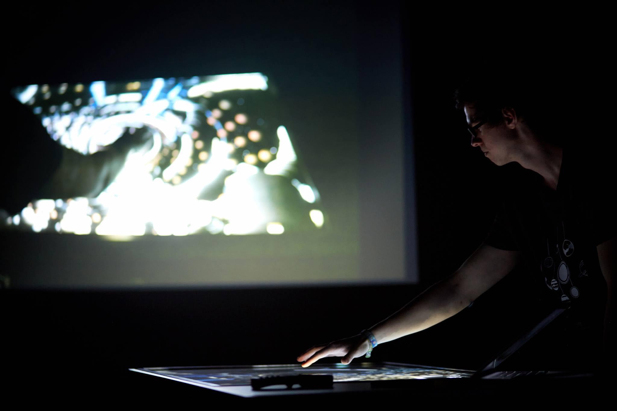
uSPHERE has been designed as an interactive installation for the museum context. The multitouch table placed in a dark, quiet environment promotes the audio-visual realization with which we wanted to transport the vastness of the universe.
Essential Experience: Weite Welten
In thinking about the Essential Experience, the essential character of the experience we wanted to create, we used the Lens of Infinite Inspiration. We asked ourselves what kind of experience we had in our lives that we wanted to share.
To see a completely different world.
Standing on a mountain and looking at the
Valley. See how the sunrays cross the country.
The feeling of vastness, of infinity. Wanderlust.
- Laura Chiesa
The essence we drew from these experiences developed in the face of our task and our chosen theme. What we retained was the idea of being pulled out of everyday life and into another, beautiful world, in which one makes new experiences as a traveller and gets a feeling of space.
Travel and Other Worlds
This is where our basic motif came from: discover and the visitor as discoverer. It fits our basic concern to make learning itself and physics itself accessible in an emotional and personal way.
Everyday Life and Vastness
In order to integrate the character that is far removed from everyday life, we were looking for a setting that was farther away from everyday life: an installation. This could be imagined in a museum and general educational context. We liked the idea of combining the museum experience with the interactive experience uSPHERE to a positive overall experience. The expanse became a multitouchtable. We wanted to transform the view of the valley into a view of our universe or solar system. A multitouchtable is particularly well suited for this purpose, as it offers a larger screen size, and planets – and of course also vastness – can be displayed more easily, while at the same time favouring the body posture for a top view – unlike, for example, a projection on a wall. This body posture in combination with the view of our solar system also implies a certain feeling of power, which subtly underlines the position as discoverer/god and can reduce fears of contact due to the technology or physics topic.
Beautiful World
Beautiful World naturally sets aesthetic standards for the audio-visual design of uSPHERE. But it also affects the concrete setting of the installation itself. It should convey a feeling of positive otherness that arouses curiosity and invites you to come closer, to see, feel, interact. We therefore decided on a spatially separate installation in the dark within the exhibition space, on the one hand of course because of the nature of the multitouchtable, but on the other hand above all because of the thematic context of the dark universe. The portal uSPHERE is thus a portal through which one is drawn to our solar system. Drawn because the process of passing through is guided by both aesthetics (audio-visual design) and technology (multi-touch table).
Solar System
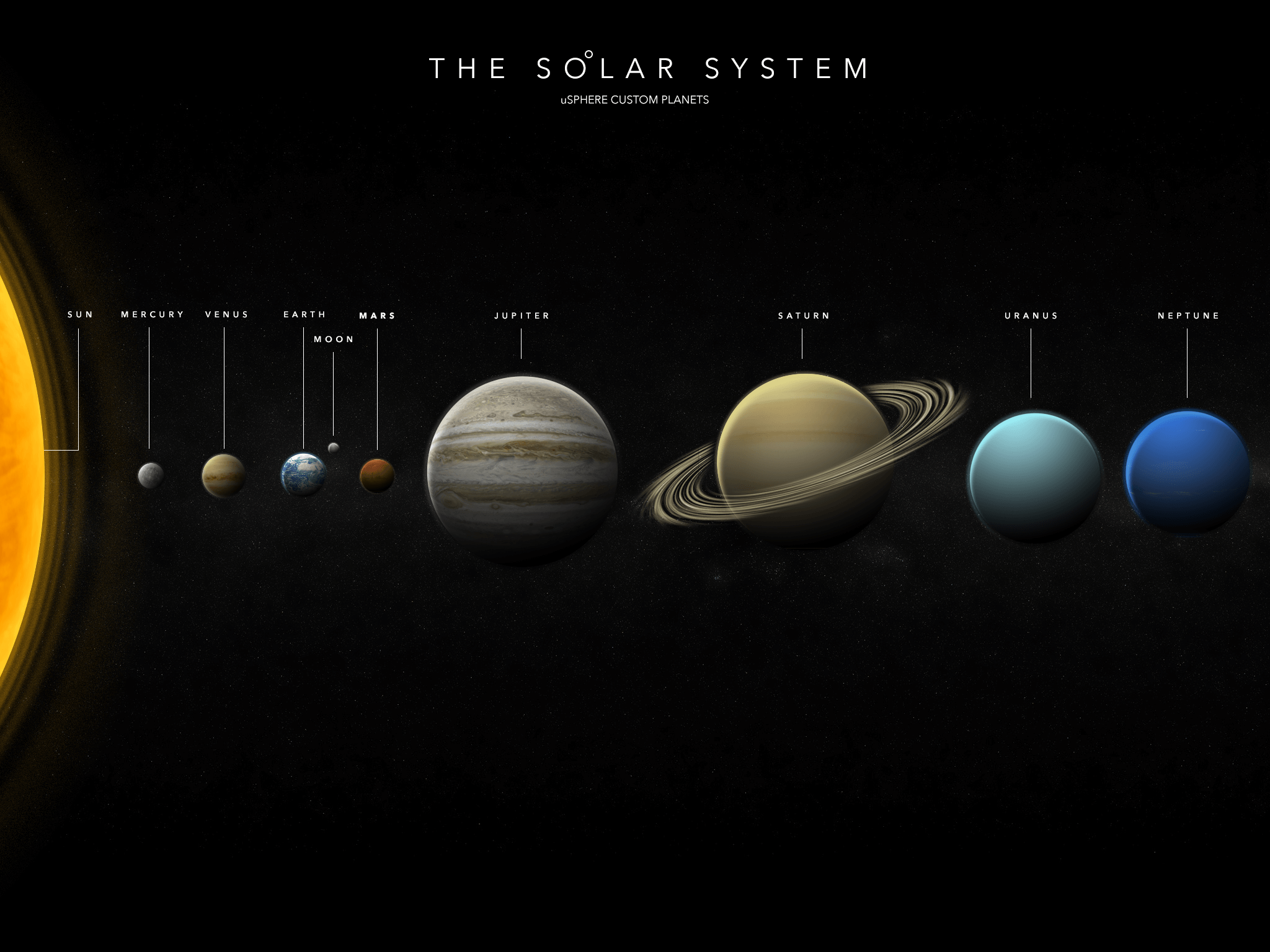
For uSPHERE we designed the planets of our solar system based on high-resolution NASA satellite images.
Mental Model: The Cockpit of a Spaceship
Behind uSPHERE there is a central mental model: the multitouch table as the on-board computer of a spaceship. Visitors become astronauts on a reconnaissance mission, who first enter the simulator, where they learn about our solar system and how gravity works. After a certain period of time, users are drawn into the game world through missions, using the navigator to steer the spaceship to its mission goal. However, the mental model is never communicated to the users in a completely transparent way, in order to arouse their curiosity via a surprise effect and thus motivate them to a deeper interaction with uSPHERE. Instead, they are guided step by step closer and deeper into the system and into the role as an astronaut.
The Simulator
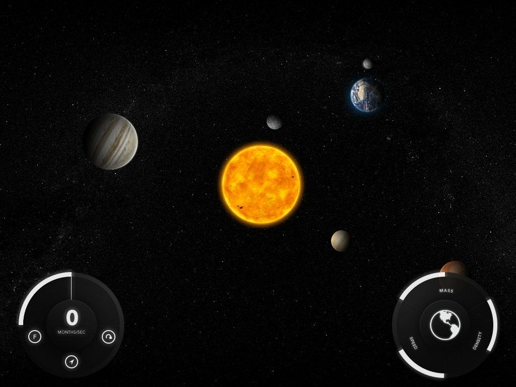
Two central UI elements allow visitors to manipulate the physical parameters of the solar system: Time as well as the mass, density and speed of the celestial bodies.
The Simulator
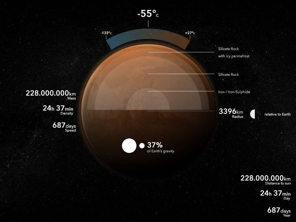
In the simulator our solar system unfolds in front of the users, who have the possibility to manipulate various parameters of the celestial bodies in the system and thus to explore its complexity and functionality in relation to gravity. It is possible to change the mass, density and velocity of individual celestial bodies, such as planets. It's even possible to remove them from completely from the sky. Users can observe how the solar system reacts to changes of individual planets. This gives them the opportunity to test the limits of the system and simulate several worst-case scenarios. In this trial-and-error interaction design, the simulator provides real-time feedback on parameter changes. In addition to the manipulations, they have access to an info screen for each celestial body with basic information to learn more.
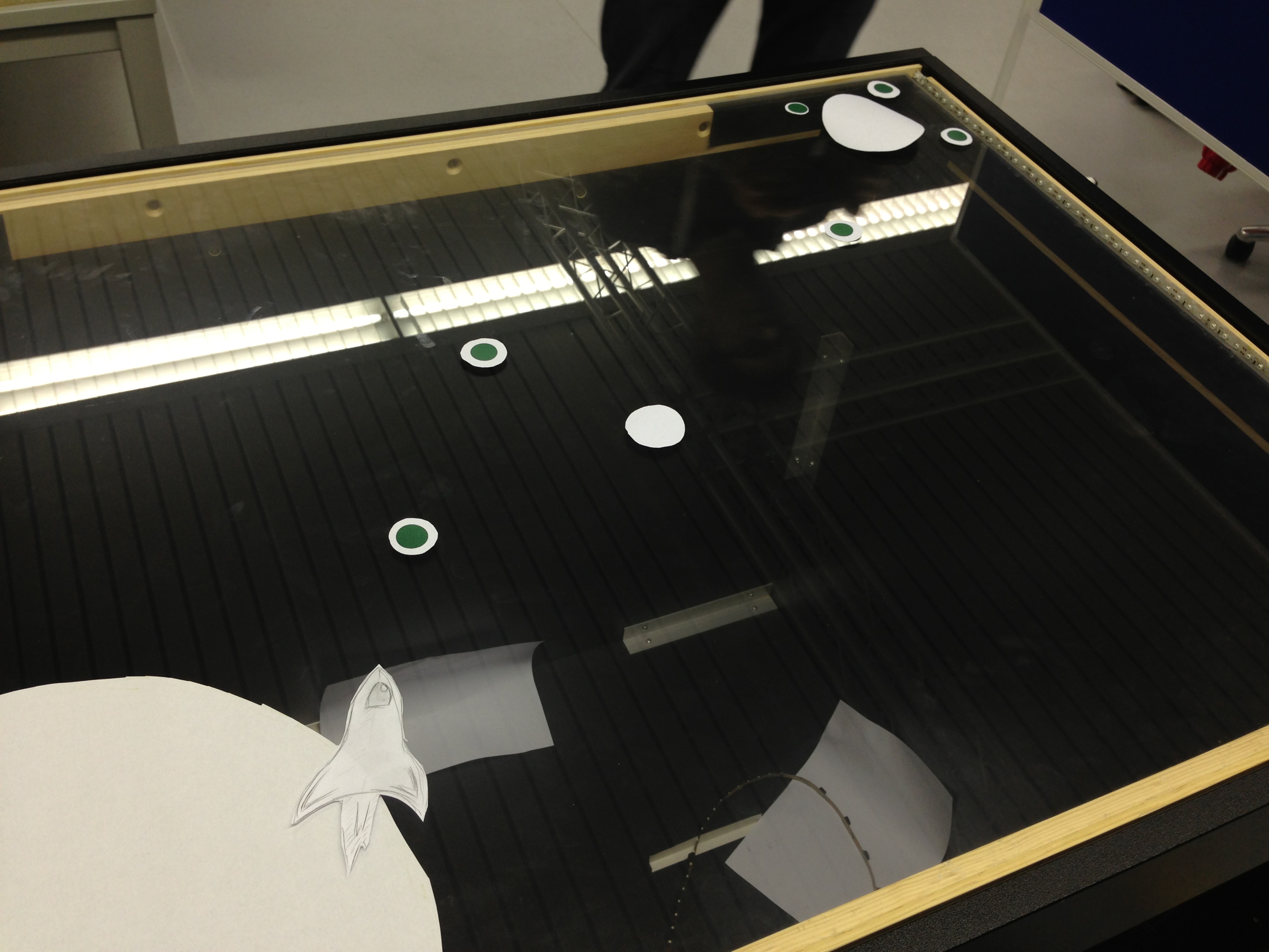
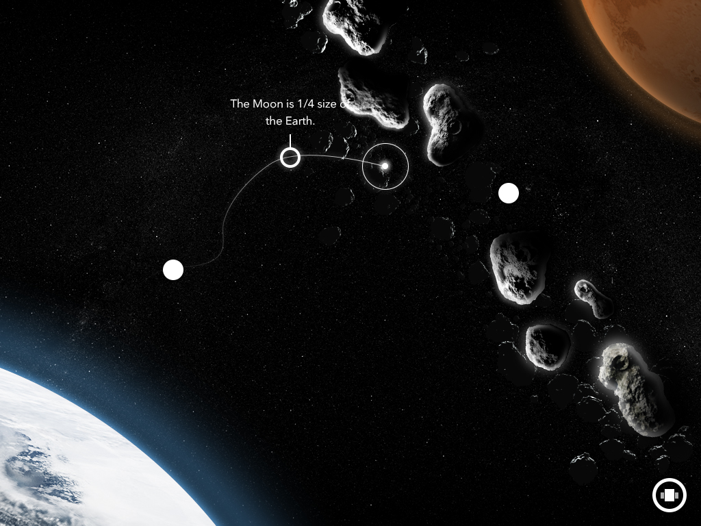
Screendesign Of The Navigator
The spaceship is shown from a distance. As much space as possible should be given for the playing area.
The Navigator
The navigator represents the playful part of the installation and is revealed to users after a certain time in the simulator. Through an incoming mission, the user is assigned to collect information about the solar system and the universe. To do this, he/she must use the gravity of individual celestial bodies and objects to steer the spaceship in such a way that certain navigation targets and ultimately a further planet are reached. However, this is not done as one would expect using classical steering methods; the course of the spaceship must be drawn by the player in advance. He/she must take into account the individual gravitational fields of planets and asteroids, which can attract and steer the spaceship off course during traveling through space.
If the player reached the individual navigation targets, he/she will be provided with information packages that are essential for the successful completion of the mission. For every information packages collected, one clue about the universe is revealed to the player.
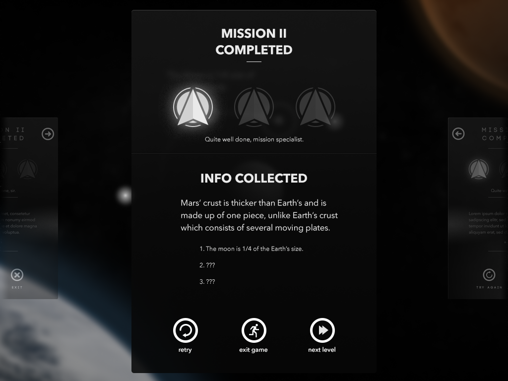
Rewards
When a player finishes the level, he/she is given information about the universe.
Visual Design
A colour scheme has been developed for all UI elements that is compatible with the broad colour spectrum of our solar system. We did not use any other bright colors that might clash with some planetary colors and thus stand out negatively. uSPHERE therefore mainly works with gray tones and transparencies that blend into the dark atmosphere. It was important that they do not block the view of the essentials, thus preserving the sense of context. At the same time they should clearly separated from the content, i.e. the solar system. The colour scheme basically consists of only two main colours. For all basic elements, like backgrounds and elements that serve merely as ornaments, a very dark shade of grey, corresponding to outer space, is used. For elements that are either used for interaction or to display important information, a very light grey tone is used so that it does not get lost under the luminosity of the planets.
Also in the design of the elements one can recognize space in an abstract form. Both in the simulator and the navigator basic circles were used. The circular movement of the sliders for setting parameters and time are also means to support this character. When arranging and designing the elements, care was taken to make the overall picture appear symmetrical as far as possible, thus emphasizing the harmony that is also created by the orbits of the individual planets.